Excellent. The only thing is the made by FL and mca ect if it can be moved over so it doesnt overlap the pictures. Otherwise it is awesome. Thanks for making the corrections. You are the best!!!!!

13 replies to this topic
#11

Harmony Havoc
-

- Cover Artists
- 712 posts
Girls Love Metallica Best
- Favorite Album:They all kick ass!
Posted 28 September 2006 - 08:02 PM

#12
franticland
-
- Cover Artists
- 196 posts
- Favorite Album:They all kick ass!
Posted 28 September 2006 - 09:40 PM
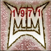
My nickname and metcoverart name are present in text bottom...
Other logos i think is cluttering

Other logos i think is cluttering

#13
metallifreak27
-
- Members
- 224 posts
- Favorite Album:They all kick ass!
Posted 28 September 2006 - 11:42 PM
thanks alot man!!!
#14
Harmony Havoc
-
- Cover Artists
- 712 posts
Girls Love Metallica Best
- Favorite Album:They all kick ass!
Posted 29 September 2006 - 02:19 AM
That is what I mean. The text at the bottom if you just move it over a smidge then the cover would be perfect.My nickname and metcoverart name are present in text bottom...
Other logos i think is cluttering

0 user(s) are reading this topic
0 members, 0 guests, 0 anonymous users

