
Wasn't all that happy with the version I found in the gallery so I wanted some feedback on this one before I go and post it in there..
Linkage
Please let me know
10 replies to this topic
#2
: post #2")
Harmony Havoc
-
- Cover Artists
- 712 posts
Girls Love Metallica Best
- Favorite Album:They all kick ass!
Posted 04 June 2006 - 04:23 PM
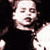
I like the back ground and the pictures on the back cover. Very cool effects you did on them. Im not so into the girl on the cover, Metallica just doesnt seem that kind of band to me, but then that is just me.  I know guys like that stuff. The quality of your arwtork is good. If it were me, Id move the title of the DVD just a little bit down or up, either seperating it from the Metallica logo or overlapping it a bit more. Over all it is a nice cover. Thanks.
I know guys like that stuff. The quality of your arwtork is good. If it were me, Id move the title of the DVD just a little bit down or up, either seperating it from the Metallica logo or overlapping it a bit more. Over all it is a nice cover. Thanks.

#3
Kathlib the Prophet
-

- Staff
- 2,885 posts
Luck. Runs. Out.
- Favorite Album:They all kick ass!
Posted 04 June 2006 - 05:44 PM
The girl doesn't bother me (then again, I'm a guy, so...). I think the Metallica logo on the shirt makes her fit in, although technically that logo wouldn't have existed in 1996, but whatever.
I have a few suggestions:
On the text on the front of the cover, its edges look choppy. The anti-alias is probably set to "None." Try setting it to "Smooth."
The girl's width is a bit stretched, but it's not too bad. On the top and bottom of her picture, you can tell where the pic ends. Try feathering the edges of the pic and it will blend a little better with the background. You can feather by selecting the bottom and top of the pic using the Rectangular Marquee Tool, then going to Selection>Feather and choosing a small number of pixels to feather by. Perhaps 7 would work out alright. Make sure your selection is at least 8 or 9 pixels over the pic, otherwise the edge won't be completely erased. After you feather, go to Edit>Clear. You may have to Undo and try it again, but you'll see what I mean. Feathering is very useful for blending images together.
The Scary Guy logo on the spine is a bit stretched, it might look better if the whole image were resized, not just the width.
Just some tips. The cover looks pretty good.
I have a few suggestions:
On the text on the front of the cover, its edges look choppy. The anti-alias is probably set to "None." Try setting it to "Smooth."
The girl's width is a bit stretched, but it's not too bad. On the top and bottom of her picture, you can tell where the pic ends. Try feathering the edges of the pic and it will blend a little better with the background. You can feather by selecting the bottom and top of the pic using the Rectangular Marquee Tool, then going to Selection>Feather and choosing a small number of pixels to feather by. Perhaps 7 would work out alright. Make sure your selection is at least 8 or 9 pixels over the pic, otherwise the edge won't be completely erased. After you feather, go to Edit>Clear. You may have to Undo and try it again, but you'll see what I mean.
Feathering is very useful for blending images together.The Scary Guy logo on the spine is a bit stretched, it might look better if the whole image were resized, not just the width.
Just some tips. The cover looks pretty good.
#4
Guest_Frans_*
Guest_Frans_*
-

- Guests
Posted 04 June 2006 - 06:05 PM
Stop! Update time!
Ok so I read your advices and went back to work..
Linkage v2
Better? Worse? The Same? Gallery material?!
Ok so I read your advices and went back to work..
Linkage v2
Better? Worse? The Same? Gallery material?!
#5
Harmony Havoc
-
- Cover Artists
- 712 posts
Girls Love Metallica Best
- Favorite Album:They all kick ass!
Posted 04 June 2006 - 06:32 PM
I like the girl better now that she's not so streached. I dont know if you can make her a bit longer and just extend her shirt off the bottom of the page or not, otherwise the feathing you did looks better.
My only other suggestion is that you turn off the spine guides it looks better withouth them showing. With those couple of adjustments I'd say go for it and upload it.
Im struggeling with a cover Im makeing, that I accidently left the guides on when I flattened several layers into the back ground and didnt notice it really until I was finished and there is no way to turn them off. So now Im doing stuff to make them blend.
My only other suggestion is that you turn off the spine guides it looks better withouth them showing. With those couple of adjustments I'd say go for it and upload it.
Im struggeling with a cover Im makeing, that I accidently left the guides on when I flattened several layers into the back ground and didnt notice it really until I was finished and there is no way to turn them off.
So now Im doing stuff to make them blend.
#6
Guest_Frans_*
Guest_Frans_*
-
- Guests
Posted 04 June 2006 - 06:43 PM
I'll fiddle around with the girl a bit (ooh dodgy)
I'm not too sure about getting rid of the spine.. I myself prefer to fold my bootleg covers so that they fit perfectly, I could however change the color of them
I'm not too sure about getting rid of the spine.. I myself prefer to fold my bootleg covers so that they fit perfectly, I could however change the color of them
#7
Kathlib the Prophet
-
- Staff
- 2,885 posts
Luck. Runs. Out.
- Favorite Album:They all kick ass!
Posted 04 June 2006 - 07:49 PM
I'm not too sure about getting rid of the spine.. I myself prefer to fold my bootleg covers so that they fit perfectly, I could however change the color of them
I usually just put my covers in the case and when I close it the cover gets folded.
The cover looks better, although the Scary Guy's arms are going to look a bit funny on the front and back of the cover all by themselves. I would either cut them off where they meet the guidelines or just resize the whole thing to 55 pixels wide (the width of the spine area). I'm not too crazy about the Metallica logo covering the girl's head. Other than that, it looks a lot better I think.
#8
frantik2k3
-
- Cover Artists
- 582 posts
The Freelancer
- Favorite Album:They all kick ass!
Posted 06 June 2006 - 12:23 AM
Yeah, I would do something with the Scary Guy on the spine. Shrink it or cut it the arms that over hang the spine limits.
#9
Harmony Havoc
-
- Cover Artists
- 712 posts
Girls Love Metallica Best
- Favorite Album:They all kick ass!
Posted 08 June 2006 - 12:47 PM
Frans, did you finsih the cover? Im curious to see the final product. Thanks for your hard work and aksing for input on your work. When I first started making cover art, I PM Mr. Metal, Frantik and Spawn to death asking for feedback on my work!! Keep up the good work!!!
#10
Guest_Frans_*
Guest_Frans_*
-
- Guests
Posted 14 June 2006 - 01:49 PM
Still working on it, had a few days away from the computer to go and see Metallica


0 user(s) are reading this topic
0 members, 0 guests, 0 anonymous users
